Should Every Casino Thumbnail Follow the Same Layout Template?
In the crowded world of online casinos, thumbnails are more than just small images—they’re gateways that invite players to explore games. With libraries boasting hundreds of titles, each thumbnail needs to stand out while maintaining a coherent brand experience. A common debate among designers and operators is whether every casino thumbnail should follow the same layout template to ensure system consistency or if diversity in design offers better engagement and user clarity.
Drawing from design principles like those from the GOV.UK Design System—particularly their guidance on contrast and accessibility—this post explores how casino thumbnails can achieve a balance between uniformity and distinct identities without losing accessibility or visual hierarchy.
Thumbnails as First Impressions
Your casino thumbnail is often the very first interaction a player has with a game. It sets the tone, promises the experience, and must communicate effectively at a glance — especially on mobile devices where thumbnails might be as small as 100x100 pixels or less.
Consider this:
- Quick Cognitive Processing: Players scan dozens, sometimes hundreds, of thumbnails before clicking. A clear, well-designed thumbnail helps avoid confusion.
- Visual Impact: The image and design need to capture attention immediately without feeling overwhelming or cluttered.
- Clarity of Message: It should convey the game’s style (slots, live dealer, roulette), theme, and quality instantly.
Failing to respect thumbnails as the first impression risks players bypassing games completely or misinterpreting the offer.
Designing for Crowded Game Libraries
When a casino lobby has 500+ games, the need for a systematic approach is obvious. However, a common mistake is adopting a rigid, identical composition for every thumbnail. While system consistency is important, so is avoiding monotony and helping players distinguish between games quickly.
The Problem with Identical Compositions
Many designs rely on a single layout repeated over and over: logo on top, a character in the center, maybe some tiny text at the bottom. These templates often suffer from the following:
- Visual Fatigue: Identical thumbnails blur together, reducing the chance of any single game standing out.
- Reduced Usability: Small differences in iconography or text become impossible to read when thumbnails follow the same template too closely.
- Confusion in Navigation: In large libraries, players rely on distinct visual clues to differentiate games quickly; identical layouts fail to deliver.
Introducing Distinct Tile Identities and Variations
Instead of imposing an identical template on every thumbnail, casinos should develop a flexible system that:
- Maintains consistent branding elements such as typography, color palette, and icon style.
- Allows for layout variations depending on the game’s content, genre, or theme.
- Creates a single focal point within each thumbnail that clearly communicates the game’s identity.
This balance leads to a lobby where each tile has its own identity but still feels like part of a cohesive whole.
Single Focal Point and Visual Hierarchy in Thumbnails
A cardinal rule in thumbnail design is the use https://reliabless.com/best-practices-for-casino-thumbnails-when-you-have-slots-and-live-games-together/ of a single strong subject rather than a “busy” composition. Overloaded thumbnails with multiple competing elements cause confusion, especially at small sizes.
Visual hierarchy guides players’ attention. For example:
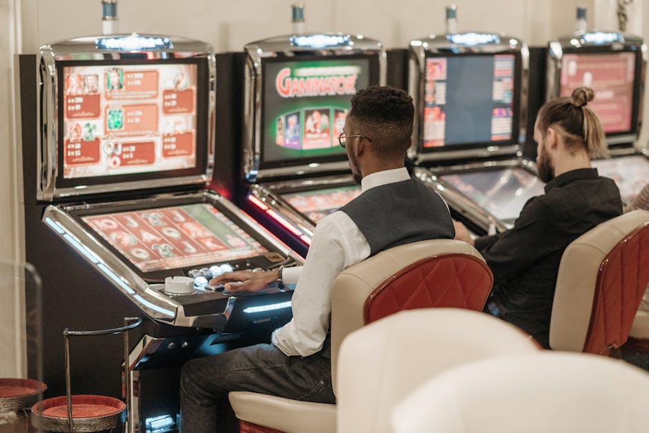

- Primary focal point: A clear central figure, object, or logo that instantly conveys game identity.
- Secondary elements: Subtle decorative components or iconography that add context without distraction.
- Text and badges: Kept minimal to avoid clutter, ideally using symbols or icons rather than small text.
Stripping back distractions helps the thumbnail read well on desktop and mobile. As I always ask while reviewing: “Will this still read at phone size?”
Contrast and Accessibility on Small Screens
Accessibility is too often overlooked in casino thumbnail design, but it should be a top priority—especially given the diversity of user devices and lighting conditions.
The GOV.UK Design System offers excellent guidance here, emphasizing:
- Strong contrast ratios: Ensure text and icons stand out clearly against backgrounds. For example, white text on a busy, multicolored background is often unreadable.
- Readable text sizes: Avoid tiny fonts or excessive text inside thumbnails. When text is necessary, it should maintain a contrast ratio of at least 4.5:1 for normal text, as per WCAG standards.
- Simple and distinct shapes: Use clear iconography or symbols rather than detailed illustrations that blur together at thumbnail size.
- Color choice sensitivity: Ensure information isn’t conveyed by color alone; use shape or contrast cues as well.
Why Prices Should Not Appear in Casino Thumbnails
One recurring mistake when designing casino thumbnails or scraping game data from third-party sources is including prices or payout details directly inside the thumbnails. There are several reasons to avoid this:
- Dynamic values: Pay tables and jackpots can vary frequently, making static price info rapidly outdated.
- Clutter: Pricing or complex numeric info crowds the tile and reduces readability.
- Regulatory concerns: In many jurisdictions, displaying payout percentages within marketing materials like thumbnails can breach compliance rules.
Instead, prices or RTP info are better suited for hover states, detailed game info panels, or separate metadata fields https://xn--toponlinecsino-uub.com/fantasy-slot-thumbnail-ideas-that-still-read-on-mobile/ rather than the thumbnail itself.
Summary: Balancing System Consistency with Distinct Tile Identities
The short answer to whether every casino thumbnail should follow the same layout template is: no, but with thoughtful guidelines.
Here’s what to aim for:
- Develop a flexible design system that enforces consistent branding and accessibility standards.
- Allow creative variation so each thumbnail can create a unique identity while retaining a shared visual language.
- Focus on a single clear focal point and a well-defined visual hierarchy that guides player attention immediately.
- Prioritize strong contrast and legibility on all screen sizes, following accessibility guidelines like those from GOV.UK.
- Exclude extraneous or rapidly changing info like prices from thumbnail designs to avoid clutter and compliance risks.
Adopting these principles ensures your casino’s game lobby feels both orderly and engaging, helping players quickly identify games they love while providing an enjoyable browsing experience across devices.
Additional Resources
- GOV.UK Contrast Guidance
- WCAG 2.1 Contrast Requirements
- Effective Thumbnail Design – UX Planet